
Are you ready to make your Mailchimp signup form look amazing?
It’s time to put some personal touches on your work. You have a basic working form (if you’ve been working through this series) and now it’s time to customize what you’ve made.
You have spent a lot of time, energy, and possibly money on the branding of your blog. You have a color scheme and perhaps you’ve paid for a logo. You use certain fonts and your blog reflects your style. Why wouldn’t you do the same with your signup forms?
Creating branded Mailchimp forms is easy. Mailchimp offers users a simple-to-use design center. Using these tools you can add graphics, pictures, text, fonts, and colors that will reflect back on you and your blog.
{Updated for 2019}
Let’s get started. Open a new tab on your browser so you can follow along as you read these instructions.
Sign into Mailchimp. Go to your list and click the Signup Forms tab on the menu. Remember to choose a General form and then scroll down to the design center portion of the screen. This is where you see the three tabs mentioned in an earlier lesson, Build It, Design It, Translate It.
We have already discussed how to use the Build It and Translate It tabs. In this lesson we will concentrate on the Design It tab. Click it now.
When you enter the design center you will see a menu of options. Each item (A) has a submenu (B). As you click across the items on the A menu the items on the B menu will also change. Try it.
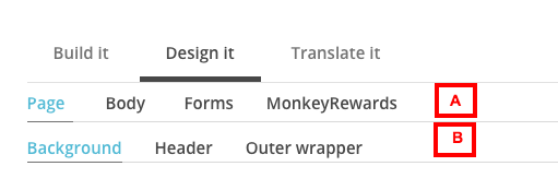
Page
Let’s begin with the Page menu. Under Page you will see the B menu. It contains:
- Background
- Header
- Outer wrapper
In the background color box you can add any color code you wish.You can also use the color picker by sliding your cursor up and down on the color bar. If you need help with color codes I recommend colorhexa.com. You can find the code for any color imaginable. You can also use the color picker by sliding your cursor up and down on the color bar.
Input your desired color code or use the color bar. Hit enter and you will see your background has changed.
If you go to Header on the B menu, you will see the options you can change if you were to make a strictly text header. We put in a graphic on our last lesson, but feel free to play around with this as you customize your form.
The Outer wrapper on the B menu applies to the area behind and below your graphic. You can make this any color you’d like using the same method as used in the background section. I usually keep mine white.

CHIMP TIP
- #ffffff is the color code for white
- #000000 is the color code for black
Body
Let’s move to Body on the A menu. On the Body B menu you will find options for customizing the:
- Foreground
- Default text
- Link style
The foreground option changes the color of the actual form. You may want to use a color here, but I would recommend leaving it white so it can be read easily.
The default text allows you to change the size, type, and color of the default text, along with line height and padding. This is the text that shows up in the message box we played with in our last lesson. You can also change the font inside the editing box for this section.
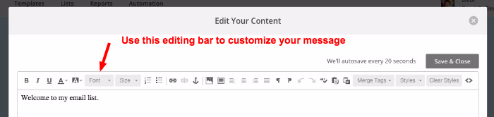
Take some time to play with this to find what suits your branding, but remember to make it easy to read. Don’t get all crazy here with fonts. Now’s not the time.
The link style option allows you to change the color of the links on the form. If you use a certain color for links on your blog, use the same color here. This will not make such an impact on your signup form, but it will be very effective on forms you use later in the signup process.
Forms
The next option on the A menu is Forms. The B menu of forms is large. It includes:
- Buttons
- Buttons hovered
- Field labels
- Field test
- Required
- Required legend
- Help text
- Errors
Some of these go together so we’ll take them in pairs.
A. Buttons / Buttons hovered
If you scroll down your form you’ll see the Subscribe button. Use the button/button hover option to change the color of your button. Brand it to your site.
B. Field labels / Field test
These are your data boxes where subscribers will put their information. You shouldn’t need to do too much adjusting to these, but you can if it helps to brand your form.

C. Required / Required legend
The required section lets you show or hide an asterisk next to the fields you require subscribers to populate. The Required legend is either hidden or not to let subscribers know what the asterisk means. Play with it, then you choose if you want to use it or not.
D. Help text / Errors
Help text is any text you want to add to help subscribers fill in the form more accurately. You will most likely not need to use this on a basic subscription form. It may help if you are using a more complicated form down the road.
The errors option lets you choose the color for the text if subscribers fail to fill in a required field. A red or orange color is recommended.
4. Monkey Rewards
Part of the price for using the free version of Mailchimp is they get to advertise on your forms. They do not put ads, but rather graphics on each of your forms. This is a low impact way for them to advertise and you do have several options for how those graphics look. {Update: The graphics have changed for 2019 but it’s all good. Don’t sweat it.}
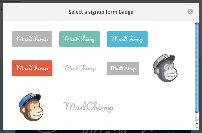
Don’t sweat this. It keeps the price free.
Here’s a shot of my final form. It’s branded to the colors of my header and contains all the info I want to collect from new subscribers. This is exactly what readers will see when they go to sign up for my email list from anywhere I have linked my unique URL (we talked about that in our last lesson.)
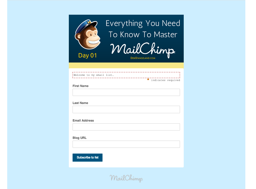
As you can see, the customization process is simple so you can easily personalize your forms to reflect your blog brand.
Do not hesitate to make your forms look exactly like your blog. It will give your readers a feeling of consistency and professionalism. It will also entice them to sign up for your email list. That’s the end goal.
If you have any questions about this section, please let me know in the comments.
#YouCanDoThis

[mc4wp_form id=”11788”]
Leave a Reply