It’s time!
You are ready to move forward into the nuts and bolds of Mailchimp signup forms if you are following along with this Mastering Mailchimp series.
Your signup forms are the bridge between your content and your readers. By enticing your readers to sign up for your email list you are afforded the opportunity to share unique and special content they can’t get anywhere else.
This is your ready-made pool of people who care what you have to say, want what you have to sell, and will share it with others so your platform grows.
How exciting is that?
But first, you have to make your signup forms beautiful. It isn’t enough to create a generic form and call it good. For maximum results you have to brand your forms to create an overall experience linking your subscribers to your blog.
Mailchimp has made this so easy. Let’s dive in.\
{Updated for 2019}
If you haven’t done so already, sign into your Mailchimp account and go to the AUDIENCE page. Then click on the audience you recently created.
Now, click SIGNUP FORMS in the menu bar. Remember, we talked about this menu bar in our last lesson.
When you click on the SIGNUP FORMS tab you will be taken to a screen that looks like this
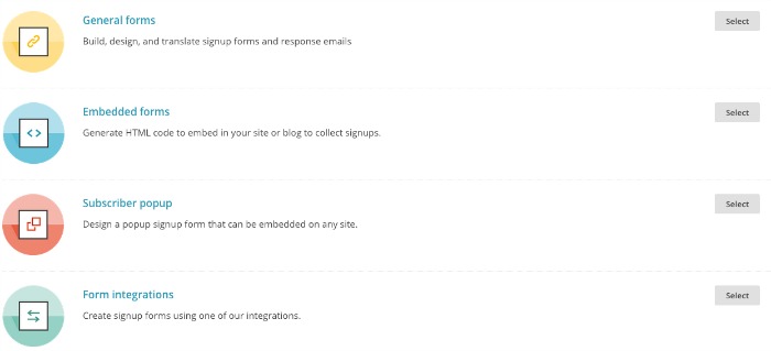
Mailchimp gives you a lot of tools on this page. We will cover these in future lessons. For today, we are going to focus on the GENERAL FORMS option. So, go ahead and select it now.
Welcome to the signup forms homepage for your list. This page will look exactly the same regardless of which list you are working with but the forms you create are unique to this list only. For each list you create you will need to create new signup forms.
Let’s look at the different parts of this page starting at the top
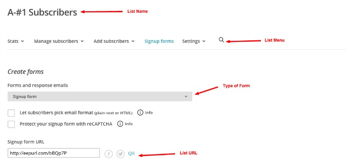
Create Forms
At the top you can see the name of your list and the list menu bar. We discussed all of the aspects of this menu bar in a previous lesson. You can access it at any time while working on your signup forms.
Next, you will find a dropdown menu for all the different forms you can customize for this list. For now we are going to stay on the signup form.
Below this dropdown menu are two checkbox options. The first is to let people choose their email format. I recommend leaving this blank. The second is to require a reCAPTCHA step when signing up for your email list. For now, I would leave this unchecked. If, in the future, your list really takes off and you find you are getting a lot of fake email signups I would come back and check this box. But, for now, leave it unchecked. The fewer steps a new subscribers has to take to get on your list, the better.
List URL
Finally, you will see the unique URL Mailchimp has assigned to this list. You will want to cut and paste this address to your notes (I use Evernote) for easy access. You can use this URL with text or graphics on your blog, on social media, in emails, or any where you want to encourage signups for your email list. This is the URL that will direct people to your signup form. It’s key.
You can also see a share button for Facebook and Twitter next to your unique URL. Use these to share your new signup form on these platforms.
The QR you see is a unique QR code graphic you can download and add to your business cards, emails, or other printable materials. Readers can use their smart devices to scan the code and be taken straight to your signup form. It’s high tech.

CHIMP TIP
If you are a speaker, or find yourself in a situation where you can pass out printed materials to potential readers, use the QR code to direct them easily to your signup form. They’ll think you are a blogging pro.
Forms List
Before we move down the page, let’s take a look at the forms we will be customizing and using. Click the gray signup form dropdown menu. Whoa! That’s a lot of forms isn’t it?
Don’t worry. When making and using Mailchimp signup forms you will only need to use the top section under Subscribe. Just a few tweaks will help us make all of these forms look professional and branded.
For now, let’s keep it on Signup form. Now, scroll down the page.
Build It Box
Below the URL you will see 3 tabs: Build It, Design It, and Translate It.
These are your lifeline to customizing your signup forms. Using these tabs you can create forms that have the look and feel of your own site. You can customize the colors, add your own header, say as much or as little as you want, and ask for whatever information you need from your subscribers.
As you can see, there is a very plain, generic form already sitting in the build it window. Let’s customize this.
You can follow along and copy exactly what I do or add your own colors and graphics as we go along.

Let’s Play
The default fields in any Mailchimp signup form are First Name, Last Name, and Email Address. I prefer to ask my subscribers for a last name because I get so many who have the same first name. It quickly allows me to find the right say, Jennifer in my list if she contacts me about something from my newsletter. You can decide if this is important for you.
A. Rearranging
Let’s do a little rearranging. First, move your cursor over the Email Address field. You will see it highlighted in yellow. Now drag it to below Last Name. See how that works?
Look to the right. You will see a number of additional fields you can add to this form. Let’s add the Website field. I like to add this field because I work with people who have blogs. It’s nice to see their work. A single click will add this field to your form.
B. Fields – adding/settings
You will also notice in that right column two tabs: Add a Field and Field Settings. When you click the Website field you just added to your form you will see the Field Settings on the right. Here you can rename this field. Let’s rename it Blog URL. Leave the Merge Tag and everything else as is.
Now, move your cursor over the First Name field. In the right column check the Required Field box. Save field.
If you move your cursor over the Email Address field and click you will see this field is already required. It’s an email list, hence, you have to give an email address.
C. Header
Okay, two more items on this form. If you move your cursor up over the name at the top of the form, this will be your list name, you will see the option to edit, remove, or use image. You can add any graphic you wish in this spot or leave it as text.
If you decide to insert an image, such as your blog header Mailchimp will resize this graphic for you. If you want to create a unique graphic for this section in Canva or PicMonkey I recommend 600px wide and 250px high as an ideal size.
Go ahead and try inserting any image in this section. When you do, you’ll be led to the graphics library. This is a great time to see how to upload a graphic and add a link URL to it.
When your graphic uploads you will be taken to a screen that looks like this
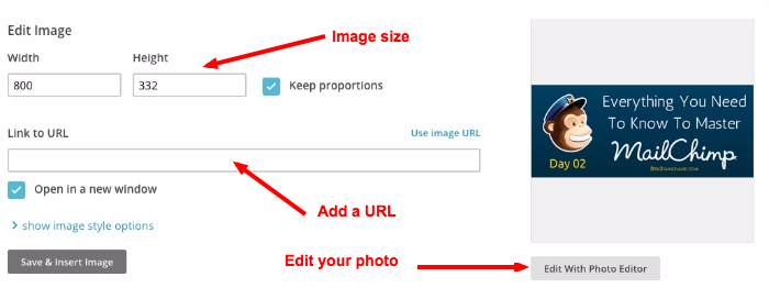
You can change the size, if you desire, add a URL, such as your blog address, and even edit the photo in the Mailchimp photo editor. When you have it the way you like it, save it.
How does it look? Play around with it if you want.
D. Message Box
Just below the image section you will see the next section you can personalize. It says “click to add message.” Go ahead and customize this section. You might welcome new subscribers or tell them what they will get with their signup.
There, you did it. You have customized your own signup form. It’s a little drab though. In our next lesson we will explore the Design It section, add some color, and insert some special features to finalize the customization process.
Translate It Box
Before you go for today go ahead and click on over to the Translate It section. Not everyone is creating an English language signup form. If you want to change the language of this form to better serve your readers, this is the place to find the language you need. There are currently over 50 language options. Check it out. It’s fun to see the instructions in other languages.
It would be easy to use the plain, unadorned signup form provided by Mailchimp. But when you take the time to customize your forms you show your readers they are important and you appreciate their willingness to be a part of your list. A personalized, professional looking list says a lot about you and your blog.
There is great value in creating forms that are branded to match your site. The value comes in a faster growing list and more sign ups than you would get with a plain form.
Do yourself and your readers a favor by taking the time to create beautiful Mailchimp signup forms. It will contribute greatly to your success.
#YouCanDoThis

[mc4wp_form id=”11788”]
Leave a Reply